
Wednesday, October 27, 2010
Punctuation Changes Everything
Friday, October 22, 2010
Cool Posters for Dexter

So for the new season of Dexter, a graphic designer put out a series of posters. They are all pretty cool and illustrative. The color scheme is amazing and all the different symbols go well together. I am a big fan of Dexter, I no longer get showtime but I used to love the show. I think these posters encompass an entire season with each one, like the first season and the ice truck killer, the second with the marriage, etc.


New Painting

A friend in class asked me to throw this up so here it is. (Sorry about the poor quality, I didn't have the proper lighting so this is the best I could do with the glare.) So back in my previous life, I was a painter. Since college I had not even lifted a paint brush until about one month ago. With nothing in particular to paint I decided to go with zombies, I went out and bought a little 8"x12" canvas and tried out painting. Unfortunately I forgot the rule of fat over thin when it comes to oil paint and this painting is slowly dripping itself into nothingness, in some places you can see the colors running down already.
So all in all, I wish I could paint more but with time restraints that is out of the question, maybe after the semester.
show and tell project

Published with Blogger-droid v1.6.3
Friday, October 15, 2010
Inno Calendar
While cruising the internet for cool things, I found this Inno Calendar. This calendar is pretty cool, it can be reorganized for over twenty different looks. The customizability is pretty cool but I would hate having to rearrange at the end of every month because it looks like the boards have built in months written on them.
Ray Ban Rare Print


So I keep finding these different examples, I never realized how big this campaign really was. Here are three more that are completely awesome.
Last weeks campaigns
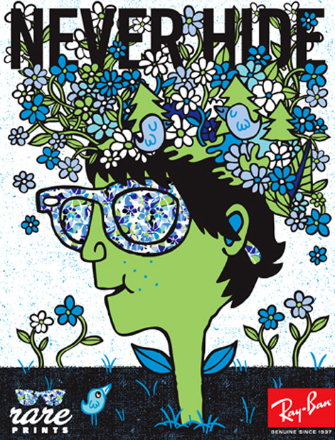

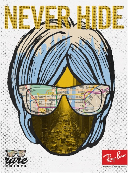
So here are some more of the ray ban rare prints that I showed in class, pretty cool stuff, they mimic the designs shown on the inside or out of the glasses
Saturday, October 9, 2010
Introducing... The Sarcmark
A new character has been added. It is the sarcmark, it is a symbol meant to show people that a sentence is sarcastic. I cannot show you this character because it costs more money than I would like to spend, but here is the link. Click Here
Tuesday, October 5, 2010
Design Critique
So I'm unsure on what to do to make this piece better so I'm leaving this up to the class. Thanks in advance for your input

Friday, October 1, 2010
Viral Marketing - Nationwide
Paint Accident - Click
We talked about different ads that showcase a design concept. This is a novel idea where Nationwide invented a fake paint company and placed their billboards above a parking lot. In one of the billboards the paint can had spilled over and covered some cars in the lot. Beside the two paint ads was a third for nationwide for car insurance. It is a brilliant combination of advertisements and mixed media that works and created a buzz for the company.
This billboard became a viral sensation and I love it.
Funny Typography Article
Since we talked about typography in class and received that pamphlet discussing the topic, I decided it would be a good time to post an article I like about it.
Fonts - Cracked
It goes through all the popular fonts and what the intended meaning is, as well as what is meant by the designer. It is interesting and funny, as most Cracked articles are.
Fonts - Cracked
It goes through all the popular fonts and what the intended meaning is, as well as what is meant by the designer. It is interesting and funny, as most Cracked articles are.
verbal definition

Published with Blogger-droid v1.6.0
visual definition

Published with Blogger-droid v1.6.0
Subscribe to:
Posts (Atom)